

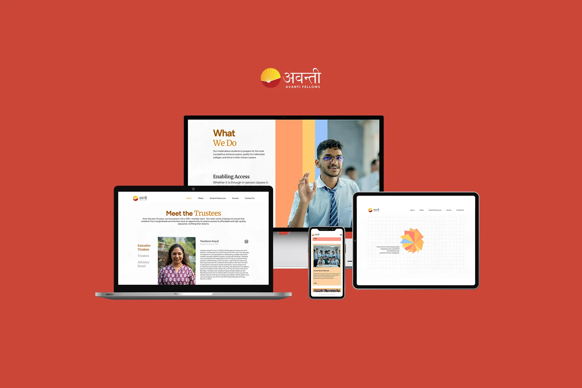
Avanti Fellows Website Revamp
A website that aims to elevate Avanti’s mission - pairing powerful student stories with a warm visual language inspired by the world of learning.
LastBench
Creative Direction and Design
Raaj Rufaro and Manvi Vaidya
Content and Project Management
Anna Joe
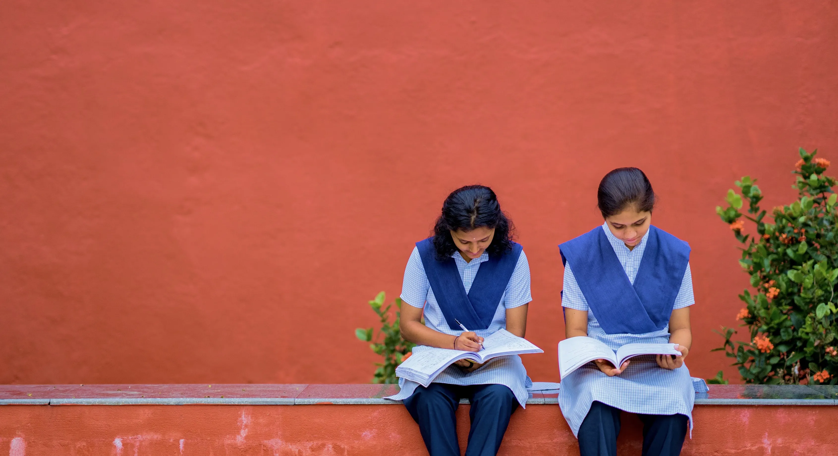
Photography
Ananth Rajesh
Production Support
Sriram Sabhapathy, Najeeb Thottungal, Nikhil Suresh
Web Development Partners
Jazz Micheal, Qamar Aziz, Burhan Upad - ThunderClap
A website that aims to elevate Avanti’s mission - pairing powerful student stories with a warm visual language inspired by the world of learning.
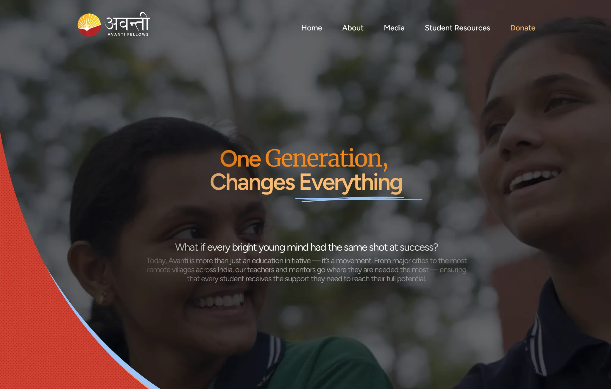
Avanti Fellows has always had a clear mission: tackling poverty through education.
And they’ve been making waves doing it.
One of the founders, Akshay Saxena, experienced the problem first-hand at IIT- how hard it was for students from low-income families to access good coaching or support. What started as him tutoring a few students eventually grew into Avanti: a nationwide effort that helps promising students get into top STEM colleges.
Today, their students aren’t just getting into IITs and international universities - many are clearing civil services, winning awards, and creating completely new futures for their families.
But their website didn’t quite reflect all of this.
It was packed with information, felt a little blocky, and didn’t carry the warmth or heart that Avanti has in real life. The team wanted the site to feel clearer, more inviting, and more human.
So the revamp focused on three things: the story, the look, and the experience.
The story
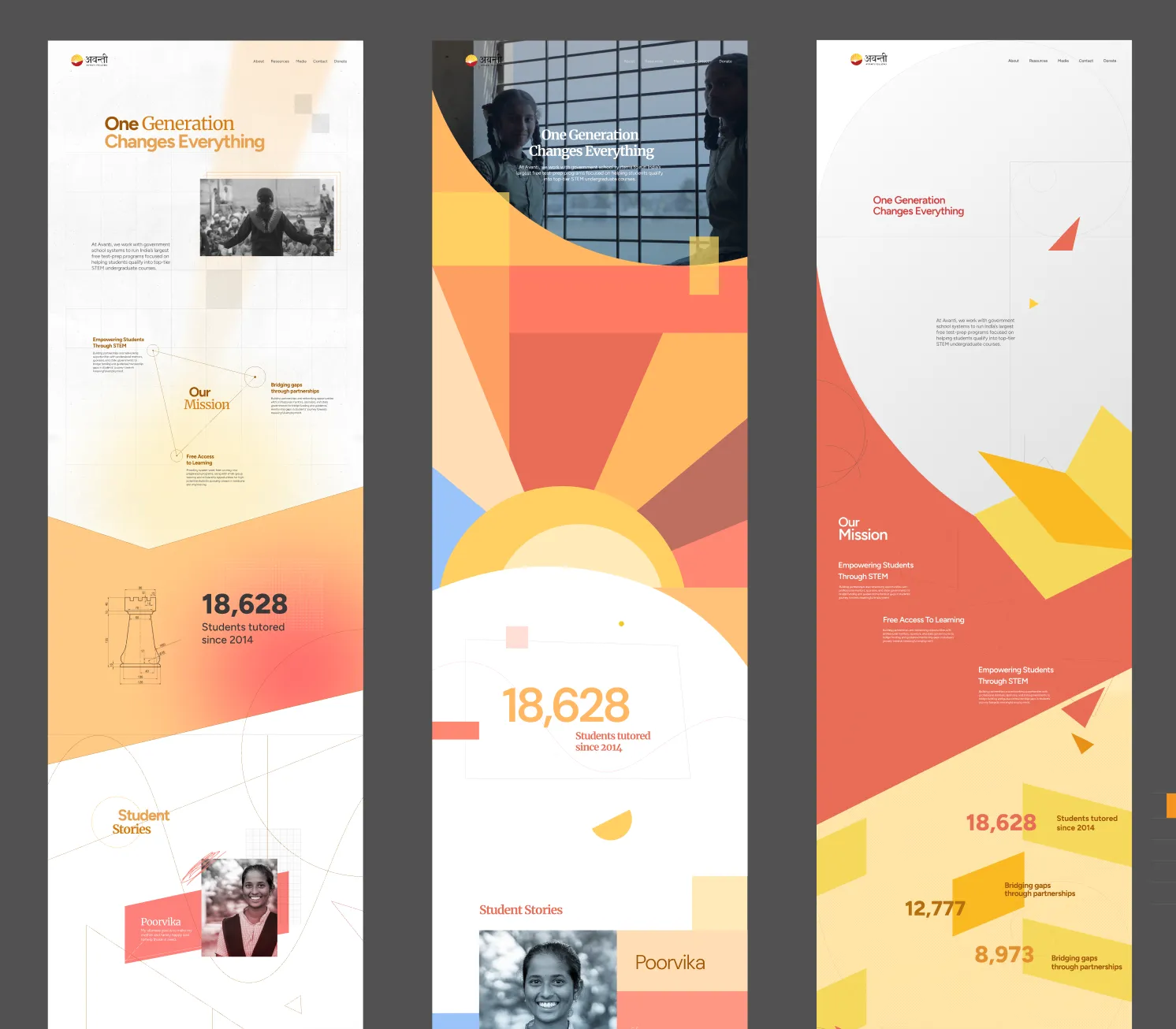
At the heart of Avanti’s work is a simple truth: education can break the cycle of intergenerational poverty.
We dug into the data and used that as the anchor for the homepage.
That’s where “One Generation Changes Everything” came from. We paired the numbers with stories of real students, so the site didn’t feel dry or heavy.
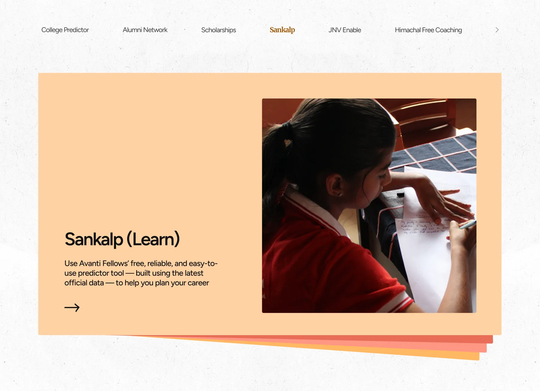
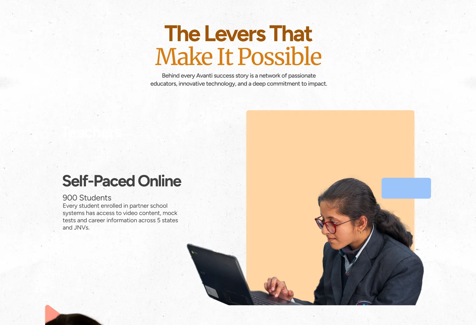
The About page became the “how” behind Avanti: a clear breakdown of the levers that make their model work. We strictly stayed clear of any jargon or clutter in all of our copy, cutting it down until it was as minimal as possible without losing clarity.
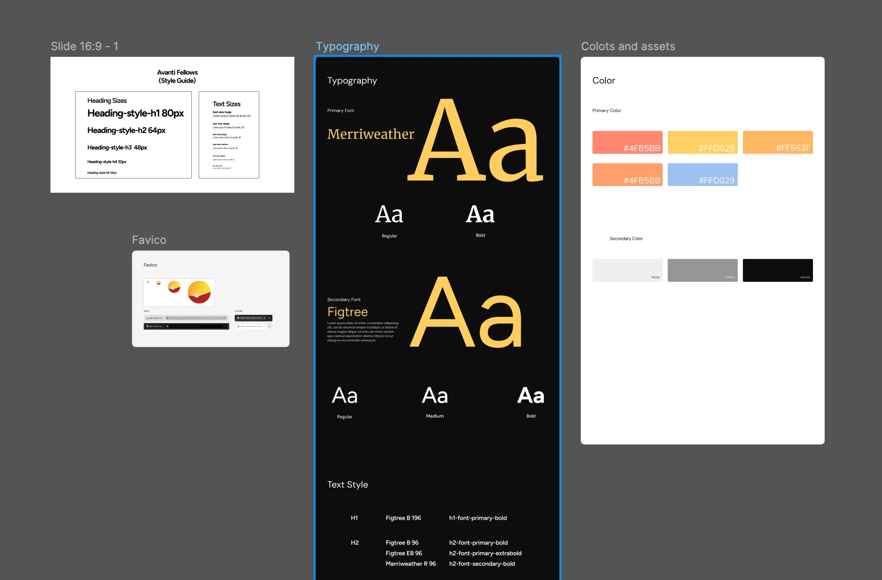
The look
While refining the story, we were also shaping the visual language.We wanted it to feel bright and rooted in education - but not too young (like elementary school).
So we pulled inspiration from things everyone remembers from school: geometry boxes, the Fibonacci sequence, the golden ratio, scribbles, equations, and post-its… that familiar world of studying.
To add another hint of playfulness, we softened their strong red by adding a pop of blue. The Avanti team immediately loved how it opened up the palette.
And instead of relying on stock images, we photographed their students and teachers ourselves. Those images added the warmth that the old site lacked.
The experience
We wanted the website to feel like you were flipping through a book- something calm, steady, and engaging.
So we built in small interactions: pages turning, images flipping, little book-like edges, and stacks of cards that reveal stories like study notes.
There’s a moment on the homepage where pages fold into a book while stories float beside it- it became a nice pause in the middle of a very data-heavy journey.

.svg)