

EdelGive Annual Report 2024–25
A water-inspired annual report designed with fluid visuals, hand-drawn illustrations, and a narrative flow that reflects the theme: “Be Water, My Friend.”
LastBench
Creative Direction and Design
Manvi Vaidya
Pakhi Verma
Illustration
Manvi Vaidya
Mehak Jain
Pakhi Verma
Content
Bruvee Manek
Team EdelGive
Project Management
Anna Joe
Bruvee Manek
Shashank Ganesh
Sriram Sabhapathy
EdelGive is one of India’s most respected philanthropic organisations - and naturally, their Annual Report is always a thoughtful piece of work. Every year, they choose a theme that reflects where they are and what they stand for. This theme then guides the tone of everything: the CXO letters, the stories, the data, the design - all of it.
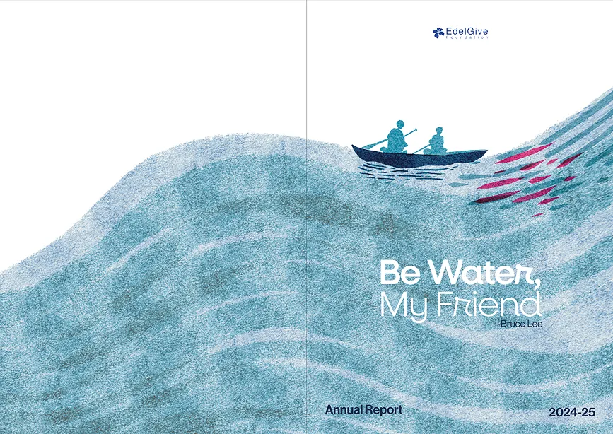
For the 2024–25 report, they came to us with a beautiful theme already in place:
“Be Water, My Friend.” If that rings a bell, yes, it is the quote by Bruce Lee. It was quite apt for a year focused on agility, potential, and flow.
Finding the language of water
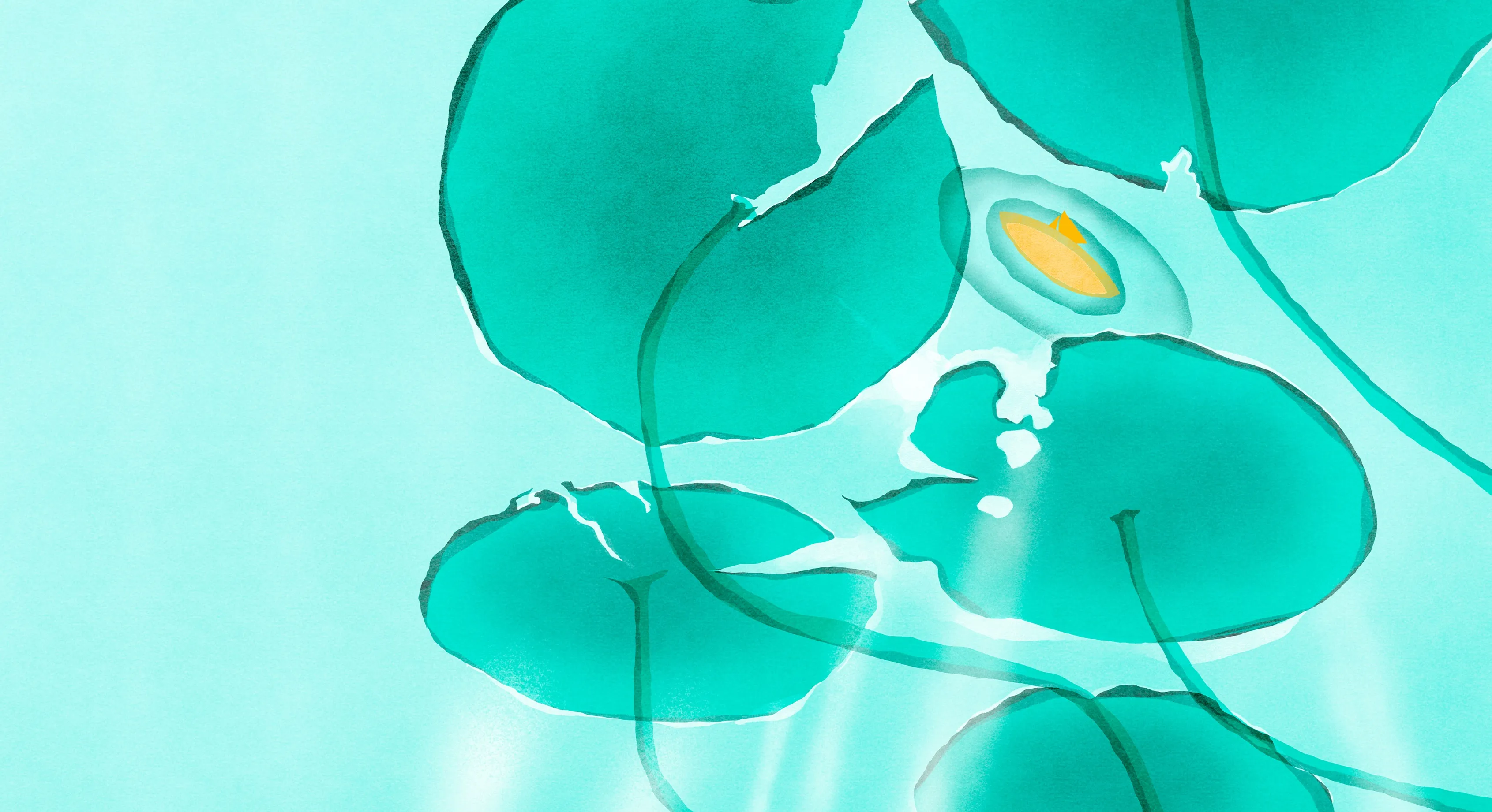
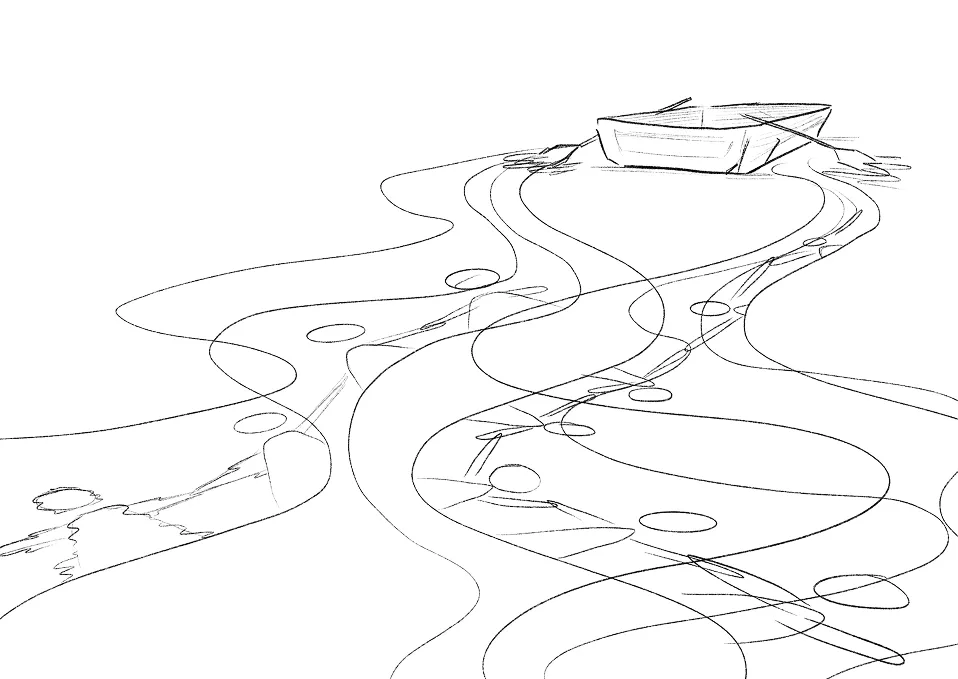
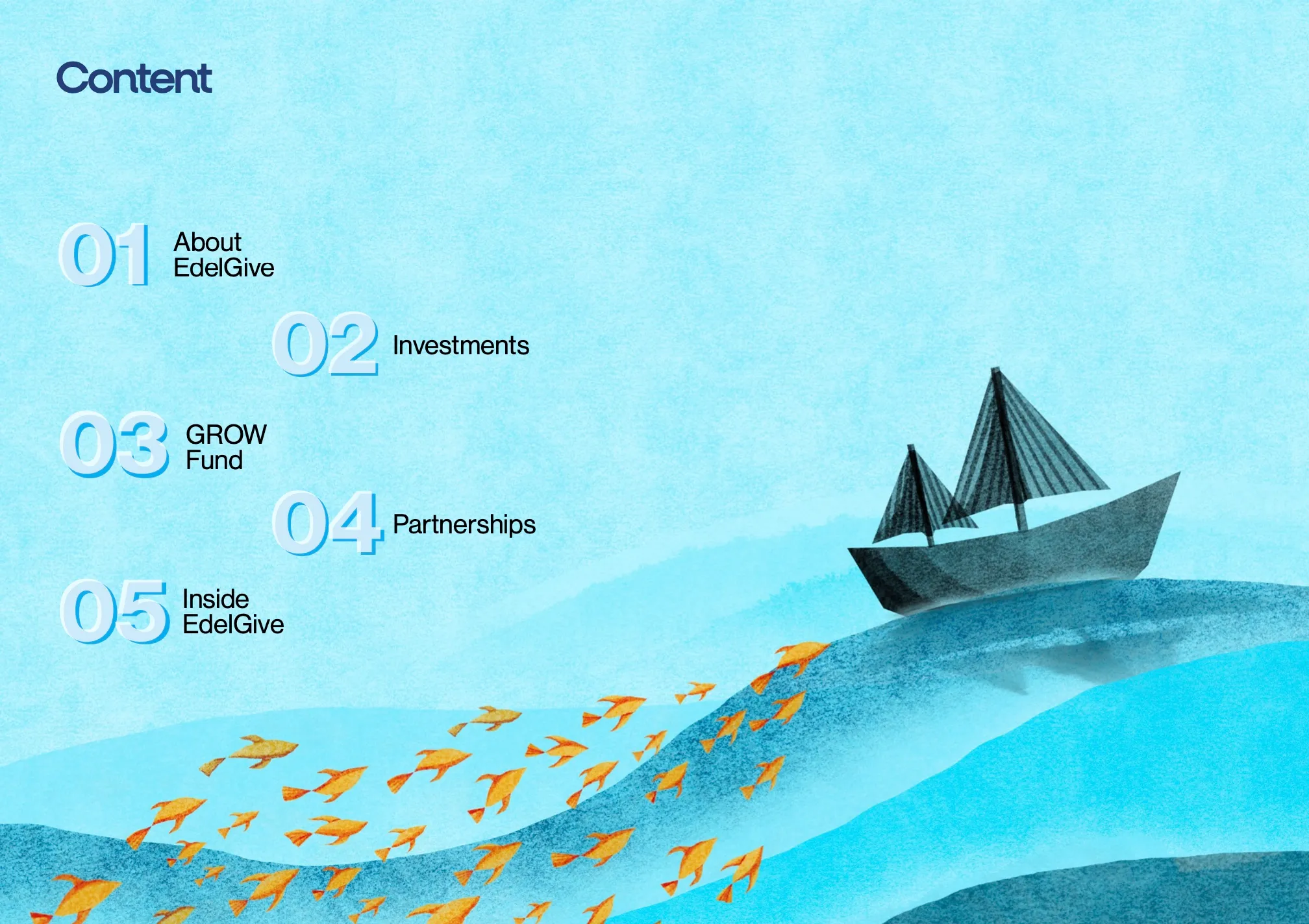
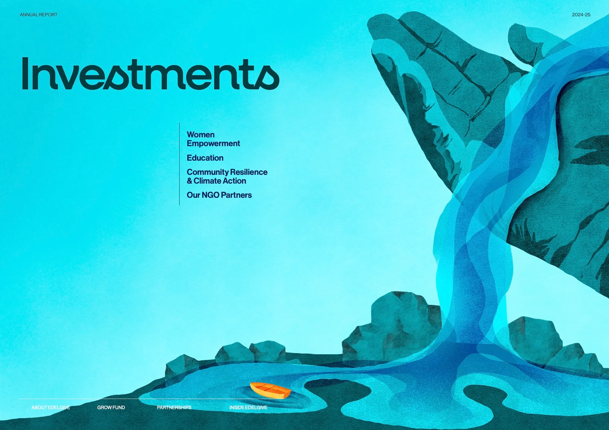
We explored a few visual directions, but the treatment that instantly resonated was a watercolour world - fluid, expressive, and full of movement. Through different forms of water - waterfalls, streams, ripples, icebergs - we built a visual system that helped organise the report’s many themes while staying true to the core idea of flexibility and growth.
For instance, GROW, EdelGive’s flagship fund that nurtures organisational capacity, drew from the nourishing, life-giving side of water. Inside EdelGive, the behind-the-scenes section, was anchored by a lighthouse casting its beam on a yellow boat (our recurring visual motif for EdelGive themselves).
A palette that transitions with the reader
We designed the report to subtly transition from light blue to deeper blues and greens as the narrative unfolds - mirroring the flow from reflection to depth, and from ideas to impact. This also helped to not visually exhaust the reader, since the shift in colours kept the look subtly interesting.
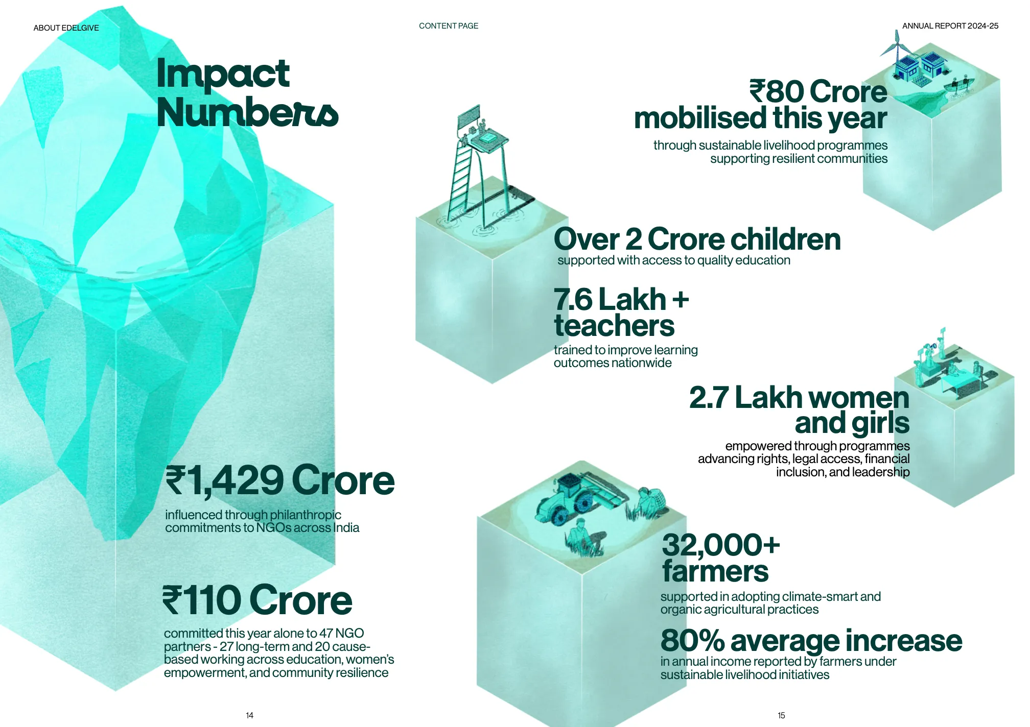
The hand-drawn illustrations also helped soften dense case studies and complex data, making the report feel spacious, human, and easier to navigate.

Designing in sync with the EG team
Because content was still being finalised in parallel to our design effort, we approached the project section by section. As soon as a chapter was ready, our team would lay it out, illustrate, review, and lock it - which kept momentum high and ensured the full publication came together smoothly within the timeline.
The final digital report is fully hyperlinked for easy navigation. And for print, we ran multiple rounds of testing to get the paper, colours, and finish just right - ensuring the tactile experience lived up to the care that went into the content.


.svg)