

Patang Rebrand
A refreshed identity for Patang as they stepped into “Patang 2.0,” retaining their grassroots warmth while making their youth-centric mission unmistakable.
LastBench
Creative Direction and Design:
Manvi Vaidya
Production Support:
Raaj Rufaro
Pakhi Verma
Project Management:
Anna Joe
A refreshed identity for Patang as they stepped into “Patang 2.0,” retaining their grassroots warmth while making their youth-centric mission unmistakable.
Patang has always been a youth-first organisation working in rural Odisha - sometimes through awareness and education, and sometimes through wonderfully unexpected methods… like an inter-gender football match in the middle of a village.
We’ve had the joy of working with them before, documenting that very match and another of their programmes on film. So when they reached out again for a third collaboration, we assumed it would be another story to capture.
It wasn’t.
Patang was entering its “Patang 2.0” phase. They were ready to expand their presence across India, and to do that, they needed a renewed identity. And because we’d walked alongside them before, they trusted us to help shape it.
We were honoured to step in.

Re-learning Patang
We began not with design, but with listening.
What were their aspirations for Patang 2.0? What parts of themselves were they carrying forward, and what were they evolving into?
Their earlier visual identity had a small but significant problem: it didn’t immediately signal that Patang is fundamentally a youth development organisation. People often missed that they work primarily with young adults-helping them lead, grow, and return to uplift their own communities.
For the new identity, this focus needed to be unmistakable.
But Patang wasn’t trying to reinvent themselves entirely. Their core-warmth, grassroots energy, and their iconic kite-remained central.
The ask was clear: help us evolve without losing who we are.
Imagining Patang
In our conversations with Rita ji, who leads Patang, and Harsh Chauhan, who heads communication, two songs kept returning to us:
“Geet Gaa Rahe Hain Hum” by Asha Bhatt and “Azaadiyan” by Amit Trivedi.
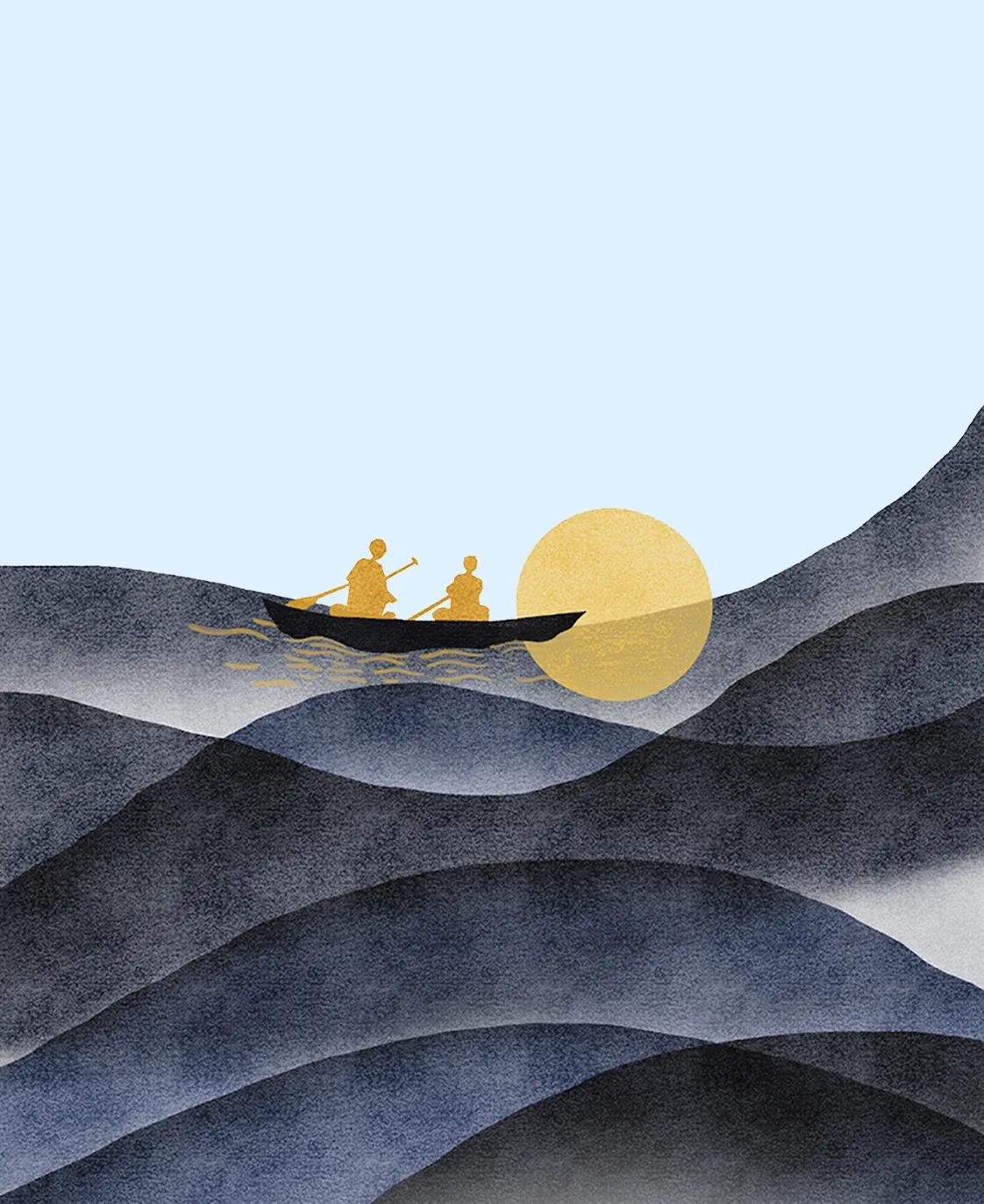
Both songs carried the same themes we saw in Patang: hope, upliftment, and the courage to soar.
We also learned about something that felt almost poetic-the circle of young people who grew through Patang’s programmes and returned years later to contribute back as mentors, trainers, and leaders. A community held together by gratitude and belonging.
Those notes of human connection shaped our direction.
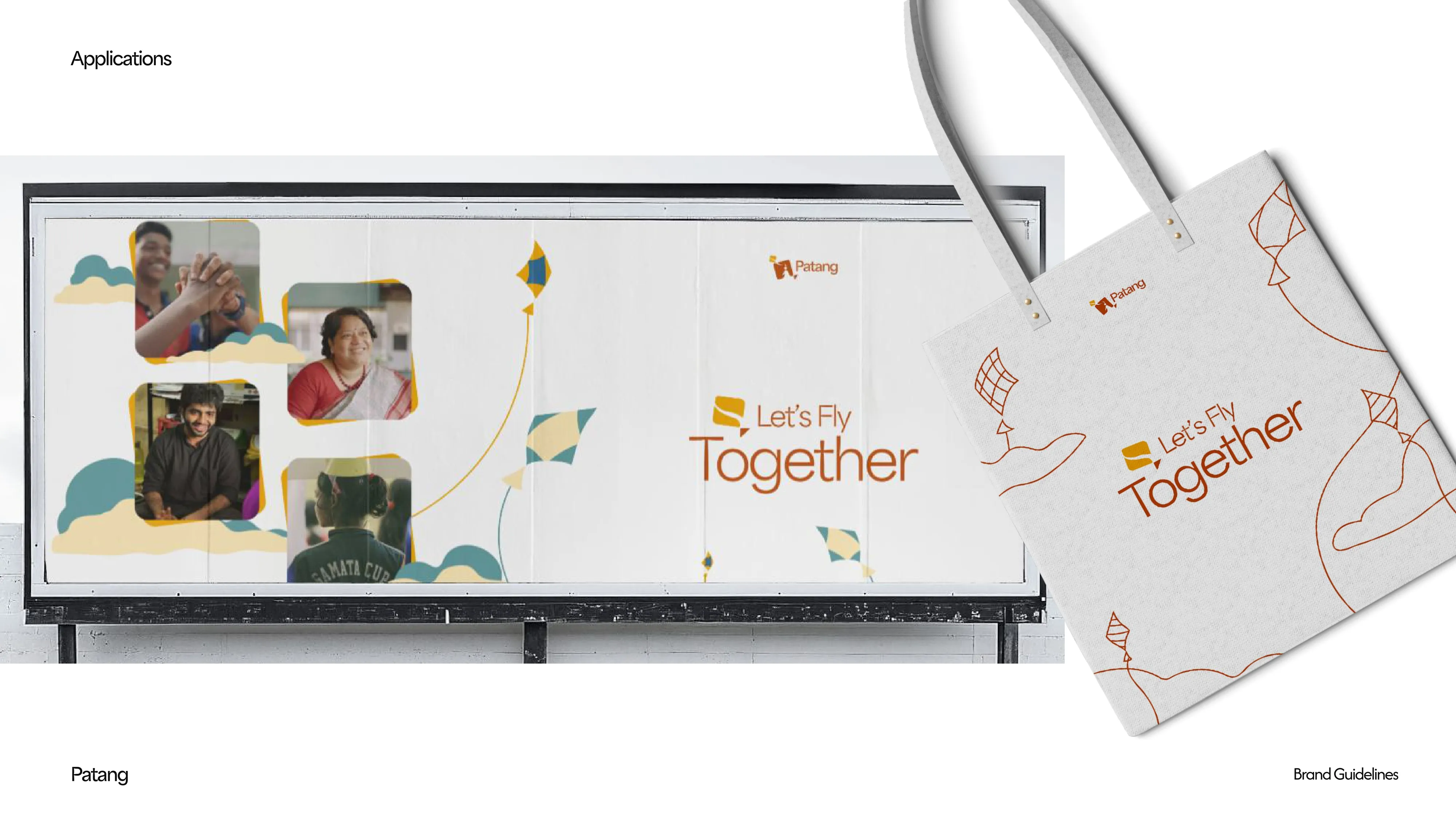
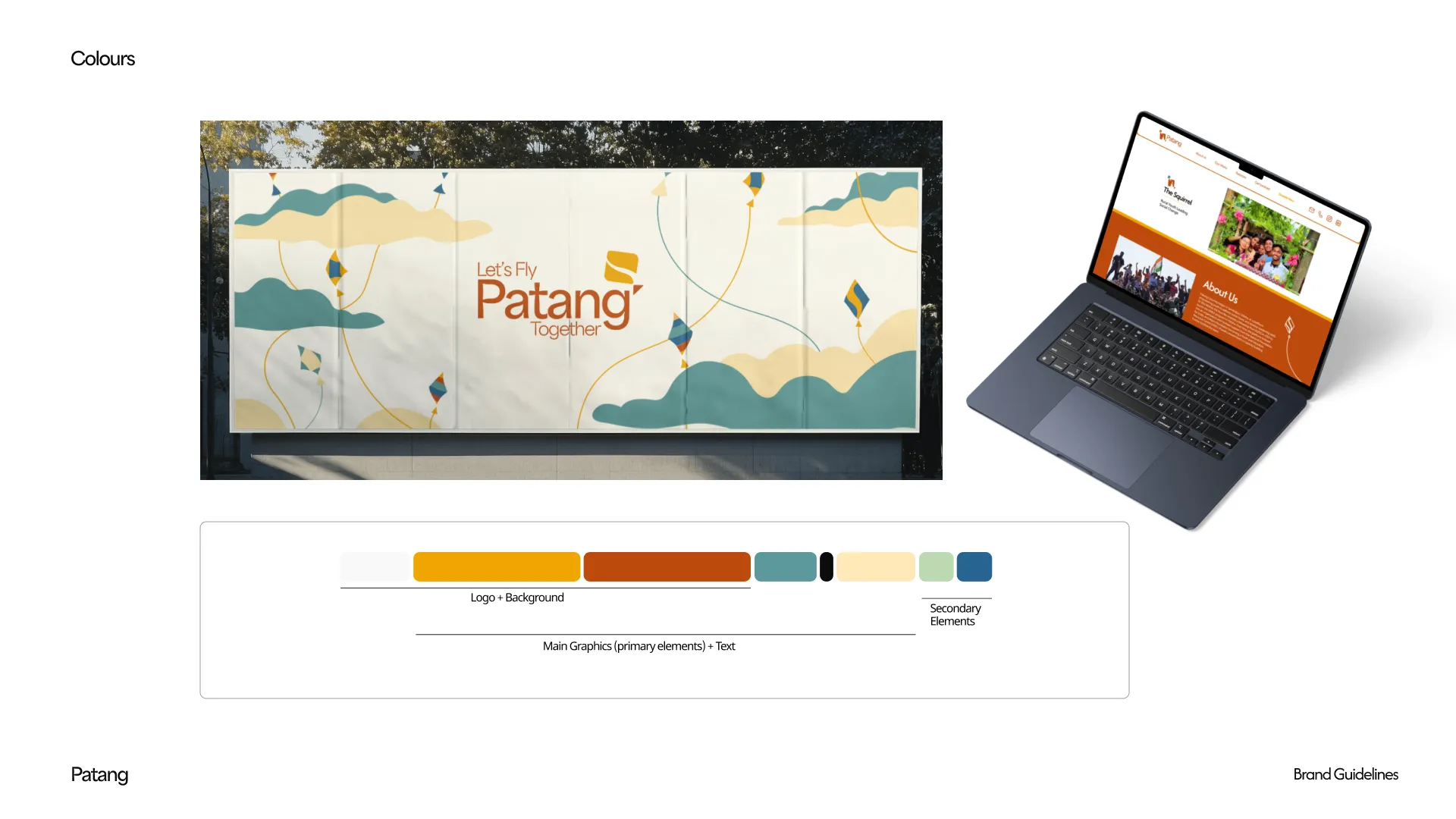
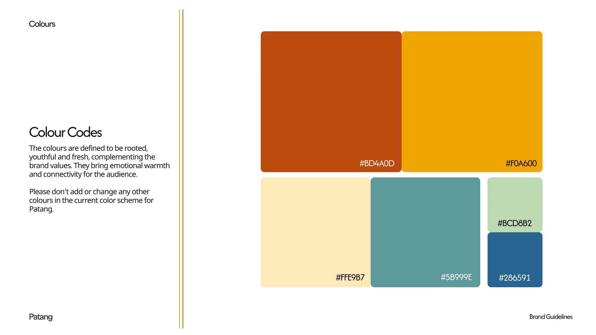
In the rebrand, these ideas took form in warmer colours, an expanded emotional palette, and a more human presence in the logo-while retaining the kite as the central symbol. Our challenge was to express Patang’s mission visually: a place where young people are encouraged, supported, and given the sky to grow into.
Creating the World of Patang
To do justice to their identity, we needed to imagine Patang’s universe.
The classrooms they teach in, the terraces they gather on - you can’t design for Patang without designing for the world they inhabit.
So we asked ourselves:
“If Patang were a space where everyone lifts each other up, what would that world look like?”
We visualised an open skyline with terraces stretching into the sky, dotted with kites-some flying with confidence, some just taking off, some waiting for their turn.
In this metaphor, the buildings became the community and environment, the people flying the kites became mentors and facilitators, and the kites themselves represented the young people Patang works with.
This world became the foundation of the brand - cohesive, warm, and instantly recognisable. It also extended beautifully into the training manual we designed alongside the rebrand, ensuring that every touchpoint spoke the same visual language.
If you'd like to see how that came together, you can read more about the manual here!


.svg)